Overview
In 2019 my organization began a project to redesign and rebuild our member site – the portion of the website that users only see once logged in. Some goals for this were:
- to make it responsive
- to enhance digital accessibility
- future proof it by building on a modern framework
One area of the member site that was scoped out of that project was the Spending Account pages. The original design was kept but built in the new framework. In 2022, I was brought in to help redesign these pages.
Problem statement
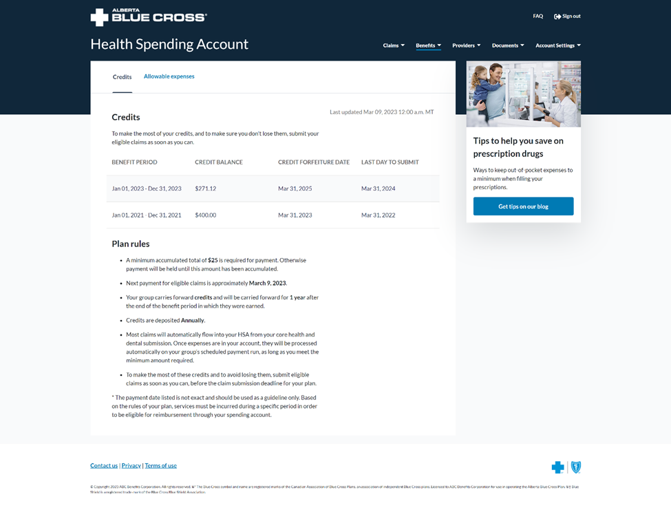
Our members could not tell, from the table presented to them, how many spending account credits they had to use in a benefit period. Our customer service department was receiving a lot of complaints related to this issue and we realized this was a major pain point. We endeavoured to give our members a better experience while increasing transparency on how spending accounts worked.
Users & Audience
We are a health insurance provider, and our main user base for this project is our group members who have a spending account included in their benefits plan.
Roles & Responsibilities
We worked in a cross-functional team of 13 people, which included: a product manager, business analysts, developers, quality assurance testers, a UX designer and a UI designer. Our stakeholders included representatives of our Customer Service, Digital Experience and Group Sales departments.
Scope & Constraints
We worked with limited capacity for some of our key team members. We were also dealing with complex plan designs, which included:
- Credits carrying-forward for a limited time, such as one benefit period,
- Credits that carried forward forever,
- Credit that never carried forward and forfeited after a benefit period,
- Expenses that could be carried over into the next benefit period,
- Various lengths of run-off periods for when members could get their claims submitted.
We also needed the designs to meet WCAG 2.1 accessibility requirements.
Research process
We put the current design through a series of unmoderated usability tests, using UserTesting as our platform, to understand better how people viewed the information presented to them.
We wanted to learn what questions they asked when interpreting the table, as well as reading through the plan rules. We pulled responses from our satisfaction survey and narrowed the comments down to those specifically pertaining to the Spending Account pages. We spoke with our partners in customer service, to learn what frustrations they are hearing from our members. We were also testing a hypothesis that people did not understand what forfeiture meant, or how it works.
Core learnings
We learned that people know exactly what forfeiture is, and have a solid understanding of it. From compiling all the data we knew we had to focus our design solution on the following:
- How much do I have right now to spend today?
- When do I need to use my credits so I don’t lose them?
We took the approach of collaborative design, working with developers, and stakeholders, and began wireframing and creating a hierarchy of information to present on the page. What followed were many hours of meetings with a cross-functional team that included our UX/UI designers, back-end/front-end developers, and subject matter experts from both customer services and customer experience. As we prototyped proposed solutions, we broke them down into what was feasible for our first release, what could be put in the next, and what special scenarios we had to be mindful of. These co-creation sessions would become a highlight of this project for everyone on the team. They helped to align us with our goals, push the boundaries of what is possible, and keep our customer’s experience at the forefront.
When we had the prototypes in a somewhat final state, we leaned into usability testing to ensure that our users could easily understand the two main priorities: how much they had to use and when they needed to use those credits to avoid forfeiting them. We went through many iterations of the card detailing the current benefit period, how many credits are left to use, and the deadline to use those credits before settling on the design below:
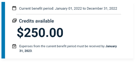
One thing that came up consistently in usability testing of the current and proposed designs, was the confusion around how credits carry forward and when they forfeit. We tried many different approaches to simplify this process and make it easier to understand. After multiple usability tests, we settled on the most simplistic approach: show them the math.
Through the usability tests, we were confident we were presenting people with the most important information above the fold. When we turned our focus to the plan rules, we learned that the information was overwhelming and decided to put them in an accordion as we did not want to distract from the reason most people visited the page – to see how many credits they had left to use. We simplified the language of the plan rules and added a deadlines section. We already knew that users were confused about the deadlines to use credits and the deadlines to submit their expenses since those were different dates. Again, we tested this to make sure it was easy to comprehend, and that people were aware of the deadline to submit expenses.
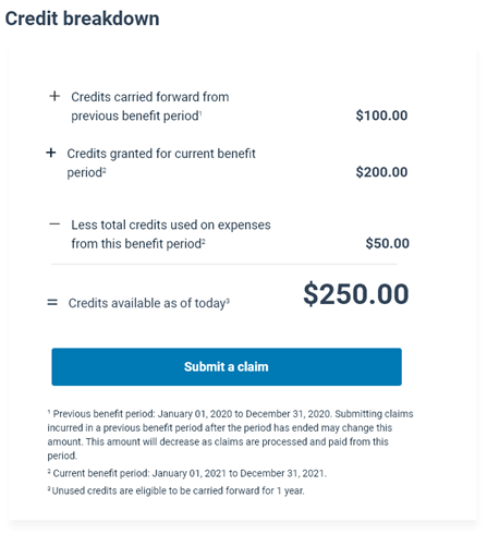
Once we had the most important information accounted for, we decided to bring a little delight to this section of the member site and introduced the idea of a spending account dashboard. From our usability testing, we kept hearing that people interpreted information in different ways and wanted more visual elements, rather than text. Throughout this whole process, we tried various ways to visually show the credits allocated, credit usage and credits carried forward. However, we were constrained in ensuring digital accessibility and data availability within legacy systems and some of our initial attempts at creating graphs were not easily interpreted. We almost went to production with the below graph until we realized we hadn’t usability tested it.
We were glad we hit pause and revisited this one as it performed very poorly in the usability tests. We went back to the literal drawing board, and this helped us make a few decisions:
- The information on the spending account landing page had to be specific to the current benefit period.
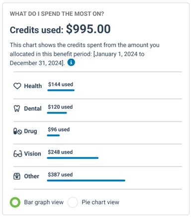
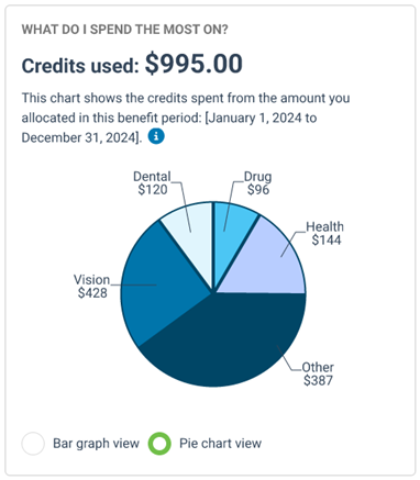
- We wanted to give people a breakdown of their credit usage per category spent i.e. health, drug, dental, and vision claims.
- We wanted the information on the spending account dashboard to be historic – going back three benefit periods.
We realized that the chart did not help with interpretation and found other ways to visually highlight key information.
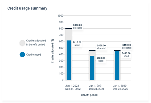
We had other charts (see below) showing where users were spending their spending account credits and we learned through testing that people enjoyed seeing the information in two ways. There was an even 50/50 split between those who preferred to see the breakdown per category in a bar chart and those who found the pie chart easier to interpret. So, we decided to keep them both and allow the user to choose how they wanted to view their breakdown of categories. We received very positive feedback from our usability tests on this approach, people loved knowing more about their spending habits over the year and they appreciated seeing the breakdown per category and the ability to change the view.
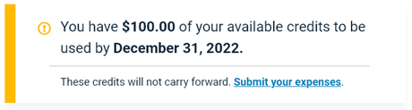
Another major call driver, and a difficult one, was the scenario of credits forfeiting and individuals being upset when they didn’t know that their credits were not carried forward. To better support our users’ health and wellness, we want them to be able to use their credits and avoid negative surprises, so we introduced warning notifications that will display three months before credits are forfeited. In these notifications, we give people the amount of credits they have left, and the deadline to submit expenses. Credit forfeiture notification emails were initially descoped, but are in the process of implementation. The warnings and notifications are features that our Customer Service department is exceptionally excited about.
Conclusion
The redesign of the Spending Account pages within our member site is a success story for cross-functional teams and usability testing. Our goal was to take a page that was a significant call driver and frustration point for our members and make it easier to understand. By conducting discovery and usability tests and taking the time to learn our members’ pain points, needs and expectations, we were able to deliver designs that delighted members while increasing transparency in how credit allocation and forfeiture of credits work. A year-over-year look at the number of calls related to Spending Accounts, from May to December 2023 and May to December 2024 has resulted in an eight percent decrease in calls.